{"id":3259,"title":"Solution 1 - Average HouseHold Expenditure Between 1950 And 2010","advertisement_flag":false,"content":"\n\u003cp\u003eThe pie charts below show the average household expenditures in a country in 1950 and 2010. Summarise the information by selecting and reporting the main features, and make comparisons where relevant.\u003c/p\u003e\n\n\u003cp\u003e\u003ca href=\"/d/272-1-ielts-writing-pie-chart-average-household-expenditure-1950-2010\" rel=\"nofollow\"\u003eSolution 1\u003c/a\u003e\u003c/p\u003e\n","created_at":"2017-08-13T16:01:29.000Z","author_name":"Bob","tag_groups":["ielts-writing-part-1|IELTS Writing Part 1|false","ielts-writing-part-1-academic|IELTS Writing Part 1 Academic|false","ielts-writing-diagram-bar-chart|IELTS Writing Diagram Bar Chart|false","ielts-writing|IELTS Writing|false","ielts-writing-graphs|IELTS Writing Graphs|false","ielts-academic-writing|IELTS Academic Writing|false"],"author_id":1,"slug":"272-1-ielts-writing-pie-chart-average-household-expenditure-1950-2010","parent_id":null,"visits":4755,"likes":5,"image":"/rails/active_storage/representations/eyJfcmFpbHMiOnsibWVzc2FnZSI6IkJBaHBBc2dDIiwiZXhwIjpudWxsLCJwdXIiOiJibG9iX2lkIn19--e25a8b27c5ef9648f1a79553233d0632c1aa49f0/eyJfcmFpbHMiOnsibWVzc2FnZSI6IkJBaDdCam9MY21WemFYcGxTU0lOTVRFd01IZzJNakVHT2daRlZBPT0iLCJleHAiOm51bGwsInB1ciI6InZhcmlhdGlvbiJ9fQ==--03073c48c81b618581157c4a4bd8e0bb47be452b/ielts-writing-average-household-expenditure.png"}
[{"id":3260,"title":null,"advertisement_flag":false,"author_id":1,"content":"\n\u003cp\u003eThe pie charts give information about the amount of money spent on various expenses in a county in two different years ( 1950 and 2010) \u003c/p\u003e\n\n\u003cp\u003eOverall while housing and food were the main expenses in the two years given, transportation only made up a small amount of household budget. There was a significant decrease in the expenditures on housing and education, whereas an increase can be seen in the figures for food, healthcare, and other expenses. \u003c/p\u003e\n\n\u003cp\u003eIn 1950, nearly three-quarters ( 72.1 percent) of household expenses were on housing and this, then, dropped dramatically to only 22 percent in 2010. In contrast, there was a slight increase by 2.1 percent in the expenditures on healthcare to reach 4.5 percent in the second year. \u003c/p\u003e\n\n\u003cp\u003eExpenditure on food, which comprised of the second largest proportion of all in the first year ( about 11.2 percent) witnessed a drastic rise in its figure to 34 percent in 2010. Likewise, the expense for transportation increased from 3.3 to 14 percent during the same period. \u003c/p\u003e\n\n\u003cp\u003eOn the other hand, there was a mere 0.3 fall in the amount of money spent on education to 6.3 percent in the second year.\u003c/p\u003e\n","created_at":"2017-08-13T16:01:29.000Z","author_name":"nguyen69","tag_groups":[],"slug":null,"parent_id":3259,"visits":0,"likes":-1,"image":"/rails/active_storage/representations/eyJfcmFpbHMiOnsibWVzc2FnZSI6IkJBaHBBc2tDIiwiZXhwIjpudWxsLCJwdXIiOiJibG9iX2lkIn19--9328121c4d14bfd98c42c220725002a62207f644/eyJfcmFpbHMiOnsibWVzc2FnZSI6IkJBaDdCam9MY21WemFYcGxTU0lOTVRFd01IZzJNakVHT2daRlZBPT0iLCJleHAiOm51bGwsInB1ciI6InZhcmlhdGlvbiJ9fQ==--03073c48c81b618581157c4a4bd8e0bb47be452b/ielts-writing-average-household-expenditure.png"},{"id":3261,"title":null,"advertisement_flag":false,"author_id":1,"content":"\n\u003cp\u003eWriting Tips:\u003c/p\u003e\n\n\u003cp\u003e\u003ca href=\"/d/how-can-i-improve-my-writing-skills\" rel=\"nofollow\"\u003eHow To Improve Writing Skills\u003c/a\u003e\u003c/p\u003e\n\n\u003cp\u003e\u003ca href=\"/d/what-required-ielts-writing\" rel=\"nofollow\"\u003eWhat Is Required In IELTS Writing\u003c/a\u003e\u003c/p\u003e\n\n\u003cp\u003e\u003ca href=\"/d/tips-ielts-vocabulary-writing\" rel=\"nofollow\"\u003eTips On IELTS Vocabulary For Writing\u003c/a\u003e\u003c/p\u003e\n\n\u003cp\u003e\u003ca href=\"/d/how-your-ielts-essays-are-graded\" rel=\"nofollow\"\u003eHow Your IELTS Essays Are Graded\u003c/a\u003e\u003c/p\u003e\n","created_at":"2017-08-13T20:46:44.000Z","author_name":"Bob","tag_groups":[],"slug":null,"parent_id":3259,"visits":0,"likes":-1,"image":"/rails/active_storage/representations/eyJfcmFpbHMiOnsibWVzc2FnZSI6IkJBaHBBc29DIiwiZXhwIjpudWxsLCJwdXIiOiJibG9iX2lkIn19--414fa16b63aa8c5eb3f0b3ff12b5b123c7fe8878/eyJfcmFpbHMiOnsibWVzc2FnZSI6IkJBaDdCam9MY21WemFYcGxTU0lOTVRFd01IZzJNakVHT2daRlZBPT0iLCJleHAiOm51bGwsInB1ciI6InZhcmlhdGlvbiJ9fQ==--03073c48c81b618581157c4a4bd8e0bb47be452b/ielts-writing-average-household-expenditure.png"}]
[{"id":2803,"name":"Solution 3 - Traffic And Pollution Problems","short_content":"Increasing the price of petrol is the best way to solve growing traffic and pollution problems. To what extend do you agree or disagree ?\n\nSolution 1\n\n ...","likes":6,"slug":"136-3-ielts-writing-increasing-price-petrol-solve-traffic-pollution-problems","tag_groups":["ielts-writing-part-2|IELTS Writing Part 2|false","ielts-writing-agree-or-disagree|IELTS Writing Agree Or Disagree|false","ielts-writing|IELTS Writing|false","ielts-academic-writing|IELTS Academic Writing|false"],"image":null},{"id":3247,"name":"Solution 1 - Money Provided For Postgraduate Research","short_content":"Money offered for postgraduate research is limited; as a consequence, some people argue that financial support from the government of the day should be ...","likes":3,"slug":"268-1-ielts-writing-money-offered-postgraduate-research","tag_groups":["ielts-writing-part-2|IELTS Writing Part 2|false","ielts-writing-agree-or-disagree|IELTS Writing Agree Or Disagree|false","ielts-writing|IELTS Writing|false","ielts-academic-writing|IELTS Academic Writing|false"],"image":null},{"id":1099,"name":"Speaking Partner - Thahimum Hassan","short_content":"Aim:\n\nwant to be a native English speaker\n\nAvailability:\n\nanytime\n\nOnline:\n\nYAHOO: hassanthahimum@yahoo.com\n ...","likes":5,"slug":"speaking-partner-thahimum-hassan","tag_groups":["english-skills-speaking-partner|English Skills - Speaking Partner|false","ielts-academic-writing|IELTS Academic Writing|false"],"image":null},{"id":3250,"name":"Solution 1 - Children Activities","short_content":"You should spend about 20 minutes on this task. The pie graphs below show the result of a survey of children's activities. The first graph shows the cu ...","likes":2,"slug":"269-1-ielts-writing-children-activities-pie-graph","tag_groups":["ielts-writing-part-1|IELTS Writing Part 1|false","ielts-writing-part-1-general|IELTS Writing Part 1 General|false","ielts-writing|IELTS Writing|false"],"image":"/rails/active_storage/representations/eyJfcmFpbHMiOnsibWVzc2FnZSI6IkJBaHBBc1VDIiwiZXhwIjpudWxsLCJwdXIiOiJibG9iX2lkIn19--e5e9cf7c0ae954f7052f7207c261191b99a0bee0/eyJfcmFpbHMiOnsibWVzc2FnZSI6IkJBaDdCam9MY21WemFYcGxTU0lNTlRBd2VESTRNQVk2QmtWVSIsImV4cCI6bnVsbCwicHVyIjoidmFyaWF0aW9uIn19--ca5be9109540261a74d36dff19d3bd7a6c51a961/pie-graph-children-activity.png"},{"id":3244,"name":"Solution 1 - Cultural Expedition","short_content":"You live in an English speaking country and you want to do some voluntary, unpaid work in a developing country. Write a letter to a company called Cult ...","likes":5,"slug":"267-1-ielts-writing-english-speaking-voluntary-cultural-expedition","tag_groups":["ielts-writing-part-1|IELTS Writing Part 1|false","ielts-writing-part-1-general|IELTS Writing Part 1 General|false","ielts-writing|IELTS Writing|false"],"image":null}]
main-forum
[{"id":70,"slug":"english-skills-listening","name":"English Skills - Listening","post_name":"News For English Skills - Listening"},{"id":72,"slug":"tips-learning-english","name":"Tips For Learning English","post_name":"News For Learning English"},{"id":73,"slug":"english-common-questions","name":"English Common Questions","post_name":"News For English Common Questions"},{"id":75,"slug":"ielts-speaking-part-1-samples","name":"IELTS Speaking Part 1 Samples","post_name":"News For IELTS Speaking Part 1 Samples"},{"id":76,"slug":"ielts-speaking-part-2-3-samples","name":"IELTS Speaking Part 2 \u0026 3 Samples","post_name":"News For IELTS Speaking Part 2 \u0026 3 Samples"},{"id":77,"slug":"ielts-speaking-samples-and-answers","name":"IELTS Speaking Samples And Answers","post_name":"News For IELTS Speaking Samples And Answers"},{"id":68,"slug":"ielts-listening-part-1","name":"IELTS Listening Part 1","post_name":"News For IELTS Listening Part 1"},{"id":74,"slug":"ielts-speaking-samples","name":"IELTS Speaking Samples","post_name":"News For IELTS Speaking Samples"},{"id":78,"slug":"english-skills-speaking-partner","name":"English Skills - Speaking Partner","post_name":"News For English Skills - Speaking Partner"},{"id":81,"slug":"ielts-writing-part-1-general","name":"IELTS Writing Part 1 General","post_name":"News For IELTS Writing Part 1 General"},{"id":83,"slug":"ielts-writing-agree-or-disagree","name":"IELTS Writing Agree Or Disagree","post_name":"News For IELTS Writing Agree Or Disagree"},{"id":84,"slug":"ielts-writing-discuss-and-give-opinion","name":"IELTS Writing Discuss And Give Opinion","post_name":"News For IELTS Writing Discuss And Give Opinion"},{"id":85,"slug":"ielts-writing-opinion","name":"IELTS Writing Opinion","post_name":"News For IELTS Writing Opinion"},{"id":82,"slug":"ielts-writing-part-1-academic","name":"IELTS Writing Part 1 Academic","post_name":"News For IELTS Writing Part 1 Academic"},{"id":86,"slug":"ielts-writing-diagram-process","name":"IELTS Writing Diagram Process","post_name":"News For IELTS Writing Diagram Process"},{"id":87,"slug":"ielts-writing-diagram-map","name":"IELTS Writing Diagram Map","post_name":"News For IELTS Writing Diagram Map"},{"id":88,"slug":"ielts-writing-diagram-bar-chart","name":"IELTS Writing Diagram Bar Chart","post_name":"News For IELTS Writing Diagram Bar Chart"},{"id":89,"slug":"ielts-writing-advantages-disadvantages","name":"IELTS Writing Advantages Disadvantages","post_name":"News For IELTS Writing Advantages Disadvantages"},{"id":90,"slug":"ielts-writing","name":"IELTS Writing","post_name":"IELTS Writing News"},{"id":91,"slug":"ielts-listening","name":"IELTS Listening","post_name":"IELTS Listening News"},{"id":79,"slug":"ielts-writing-part-1","name":"IELTS Writing Part 1","post_name":"News For IELTS Writing Part 1"},{"id":69,"slug":"ielts-listening-part-2","name":"IELTS Listening Part 2","post_name":"News For IELTS Listening Part 2"},{"id":80,"slug":"ielts-writing-part-2","name":"IELTS Writing Part 2","post_name":"News For IELTS Writing Part 2"},{"id":92,"slug":"ielts-writing-graphs","name":"IELTS Writing Graphs","post_name":"News For IELTS Writing Graphs"},{"id":93,"slug":"ielts-academic-writing","name":"IELTS Academic Writing","post_name":"News For IELTS Academic Writing"}]
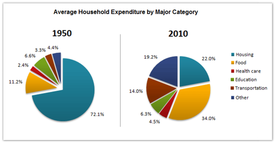
The pie charts below show the average household expenditures in a country in 1950 and 2010. Summarise the information by selecting and reporting the main features, and make comparisons where relevant.
The pie charts give information about the amount of money spent on various expenses in a county in two different years ( 1950 and 2010)
Overall while housing and food were the main expenses in the two years given, transportation only made up a small amount of household budget. There was a significant decrease in the expenditures on housing and education, whereas an increase can be seen in the figures for food, healthcare, and other expenses.
In 1950, nearly three-quarters ( 72.1 percent) of household expenses were on housing and this, then, dropped dramatically to only 22 percent in 2010. In contrast, there was a slight increase by 2.1 percent in the expenditures on healthcare to reach 4.5 percent in the second year.
Expenditure on food, which comprised of the second largest proportion of all in the first year ( about 11.2 percent) witnessed a drastic rise in its figure to 34 percent in 2010. Likewise, the expense for transportation increased from 3.3 to 14 percent during the same period.
On the other hand, there was a mere 0.3 fall in the amount of money spent on education to 6.3 percent in the second year.